
Mosaic for Confluence
Capable recognises 20 macros from Mosaic for Confluence (Kolekti): 17 convert, fully or in part, and 3 are reported and left on the page.
#About the app
Mosaic is a Confluence formatting app from Kolekti, formerly Adaptavist Content Formatting Macros.
It adds alerts, pop-up dialogs, buttons, backgrounds, cards, expands, tabs, footnotes, banners, tooltips, tables, LaTeX and HTML to a page.
#How Capable is different
Alerts, pop-up dialogs, expands and tabs become native Confluence panels and expands, so they keep working with no app installed.
Buttons, backgrounds, cards, banners, footnotes, tooltips, progress steps, LaTeX, HTML and tables move to Capable macros in one app.
Tabs become a stack of expands and pop-up dialogs become an expand, so the tab strip and the pop-up window do not carry over.
Colour palettes, alert images, alerts that pop up on page load, dismiss options and expand styling are not carried over.
BibTeX, Smart Designer, a lone progress step and LaTeX Builder content that mixes text with maths are reported and left unchanged.
#At a glance
Macro | In Capable | Support |
|---|---|---|
Alerts | Native Confluence panel | Converted |
Pop-up Dialog | Native Confluence expand, titled by the trigger text | Converted |
Button and Button Group | Capable Buttons | Partly converted |
Background | Capable Background, or a native panel for a plain colour | Partly converted |
Cards | Capable Cards | Partly converted |
Card (deprecated) | Capable Cards with one card | Partly converted |
Expand | Native Confluence expand | Converted |
Tabs | Native Confluence expands, one per tab | Converted |
Interactive Banner | Capable Banner | Partly converted |
Tooltip | Capable Tooltip | Converted |
Progress Tracker | Capable Progress Tracker | Converted |
Footnote | Capable Footnote | Converted |
Footnotes Summary | Capable Footnotes Display | Converted |
LaTeX | Capable LaTeX, inline or block | Partly converted |
HTML | Capable HTML | Converted |
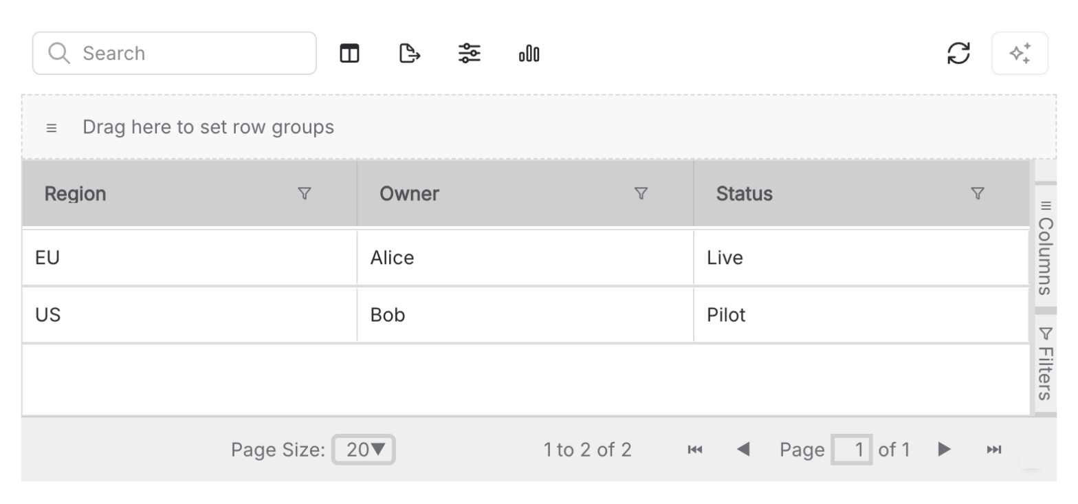
Table | Capable Table | Partly converted |
Round Rectangle (deprecated) | Capable Background | Partly converted |
Smart Page Editor | Not converted | Reported only |
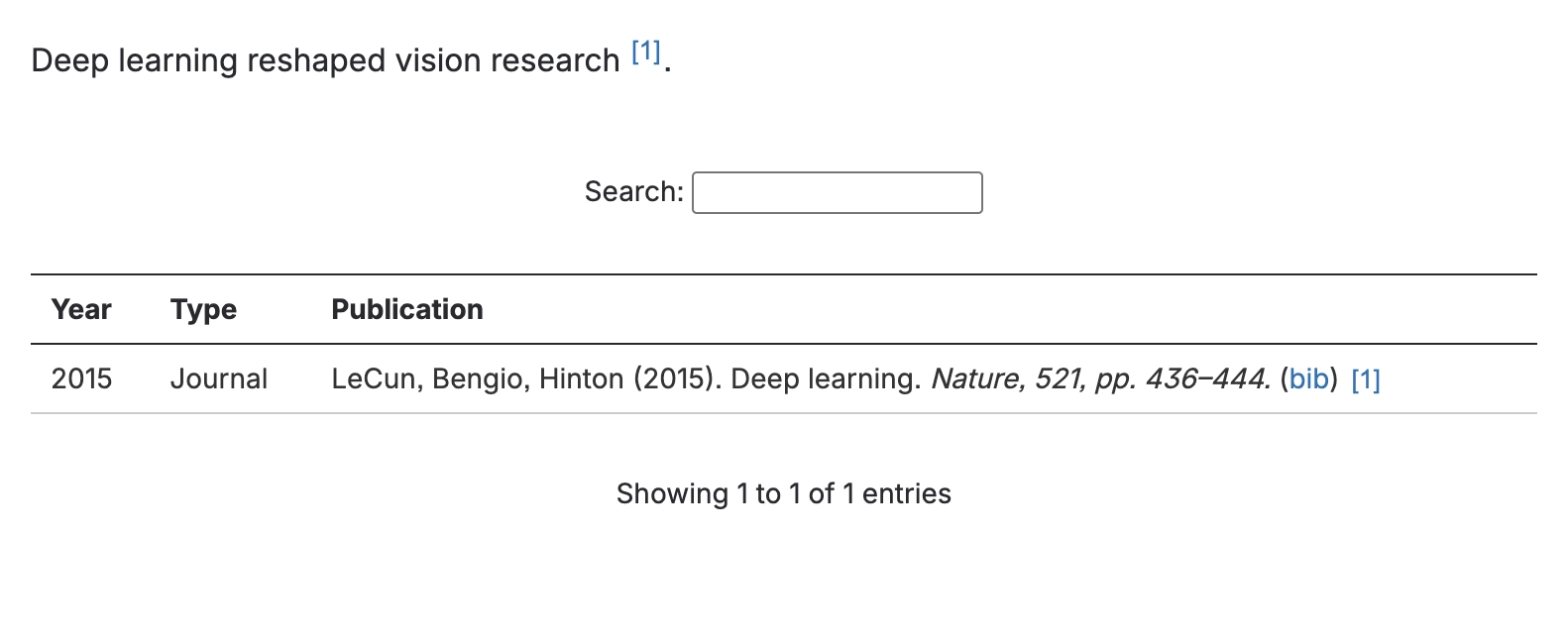
BibTeX Reference | Not converted | Reported only |
BibTeX Display | Not converted | Reported only |
#New in this release
Buttons keep their size, shape, full width, common icons, alignment and the Subtle and Link styles.
A coloured background with light text, a height preset or centred text stays a Capable Background, and image positions are kept.
Stock images in cards and banners now load from Pexels, so they keep working after Mosaic is removed.
Copied macros convert every copy, and macros nested in tabs, backgrounds, expands, panels and table cells now convert.
Alerts and expands on pages imported from Data Center, older footnotes and older progress bars now convert correctly.
Capable Buttons and Tooltips inside a Capable Background now display properly.
#What each one does
#Alerts
Becomes | Native Confluence panel |
|---|---|
Support | Converted |
Each alert type becomes the matching panel; Work in Progress, Outdated and Sensitive become coloured panels with an emoji.
Carried over
Title, as a bold first line
Body text
Alert type
Custom colour
Not carried over
Layout and alert image
Text colour
Showing the alert as a pop-up when the page opens
Permanent dismiss
Before: Mosaic
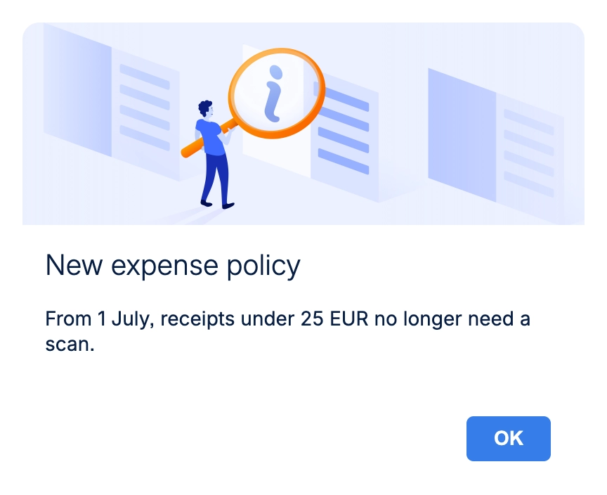
After: Capable

#Pop-up Dialog
Becomes | Native Confluence expand, titled by the trigger text |
|---|---|
Support | Converted |
Carried over
Trigger text, as the expand title
Dialog title, as a bold first line
Dialog content
Not carried over
The pop-up window itself
Width
Text and trigger alignment
Before: Mosaic

After: Capable

#Button and Button Group
Becomes | Capable Buttons |
|---|---|
Support | Partly converted |
A button group becomes one Capable Buttons macro holding all its buttons.
Carried over
Title and link, including open in a new tab
Style: filled, bordered, subtle or link
Size, shape and full width
Common icons and their position
Alignment, and a group's direction
Not carried over
Button and text colours
Icons with no Capable equivalent
Before: Mosaic

After: Capable

Before: Mosaic

After: Capable

#Background
Becomes | Capable Background, or a native panel for a plain colour |
|---|---|
Support | Partly converted |
A background with an image, light text, a height preset or centred text becomes a Capable Background; a plain colour becomes a native panel.
Carried over
Image, image opacity and image position
Background and text colour
Height
Side spacing and corner radius
Horizontal text alignment
Not carried over
Image size (fit, fill, original): the image always fills
Vertical text alignment
Width
Before: Mosaic

After: Capable

Before: Mosaic
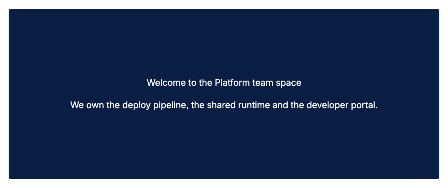
After: Capable

#Cards
Becomes | Capable Cards |
|---|---|
Support | Partly converted |
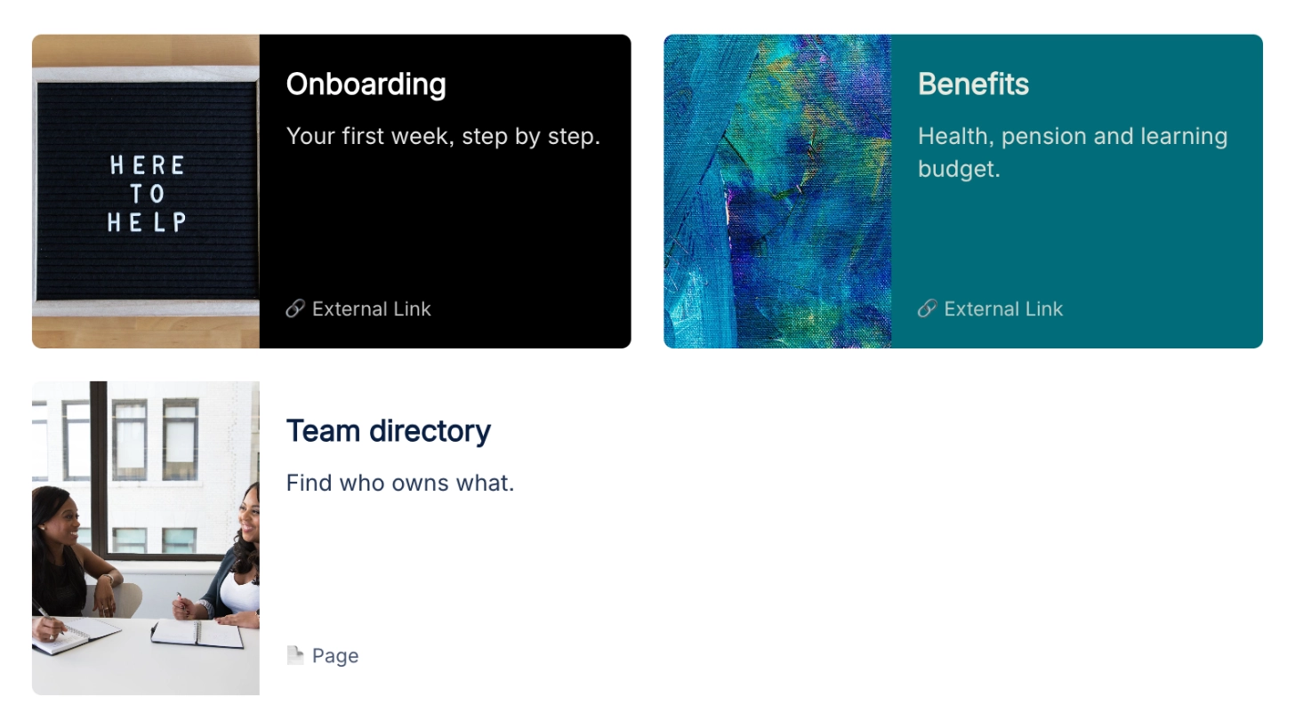
Covers Mosaic Advanced Cards. Stock images switch to the same photos on Pexels, so they keep loading after Mosaic is removed.
Carried over
Per card: title, body, image, colours and link
Column count, fixed rather than responsive
Image position
Not carried over
Colour palettes
Card alignment
Before: Mosaic
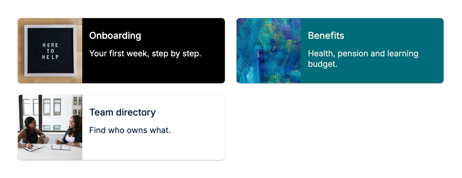
After: Capable
#Card (deprecated)
Becomes | Capable Cards with one card |
|---|---|
Support | Partly converted |
Carried over
Title, body, image, colours and link
Not carried over
Its place in a line of text: the card moves to its own line
Colour palette names
Before: Mosaic

After: Capable

#Expand
Becomes | Native Confluence expand |
|---|---|
Support | Converted |
Covers Mosaic Advanced Expand.
Carried over
Title
Content, including lists and formatting
Not carried over
Style, header size and icon
Colours
Before: Mosaic

After: Capable

#Tabs
Becomes | Native Confluence expands, one per tab |
|---|---|
Support | Converted |
Covers current, older and nestable Mosaic tabs. Macros inside a tab convert too.
Carried over
Tab names, as expand titles, in order
Tab content
Not carried over
The tab strip: tabs become a stack of expands
Colours and icons
Direction and sticky tabs
Before: Mosaic

After: Capable

#Interactive Banner
Becomes | Capable Banner |
|---|---|
Support | Partly converted |
Carried over
Per slide: title, body, button text, image and link
Auto-scroll and its interval (2 to 60 seconds)
Not carried over
Slide theme and overlay: every slide gets one standard dark overlay
Image size and position
Before: Mosaic

After: Capable

#Tooltip
Becomes | Capable Tooltip |
|---|---|
Support | Converted |
The tooltip stays where it was in the sentence, also in tables and lists.
Carried over
Tooltip text
Before: Mosaic

After: Capable

#Progress Tracker
Becomes | Capable Progress Tracker |
|---|---|
Support | Converted |
Consecutive Mosaic Progress Bar steps become one tracker. A lone step is reported and left as it is, because a tracker needs at least two steps.
Carried over
Step titles and order
Step links
The current step
Not carried over
Colours: trackers use Capable's default palette
Before: Mosaic

After: Capable


#Footnote
Becomes | Capable Footnote |
|---|---|
Support | Converted |
Convert Footnote and Footnotes Summary in the same run, or the Mosaic summary left on the page shows nothing.
Carried over
Footnote text
Numbering, current and older footnotes
Before: Mosaic

After: Capable

#Footnotes Summary
Becomes | Capable Footnotes Display |
|---|---|
Support | Converted |
Lists the page's footnotes; there are no settings to carry over.
#LaTeX
Becomes | Capable LaTeX, inline or block |
|---|---|
Support | Partly converted |
Covers LaTeX Builder, LaTeX Inline and the older LaTeX Formatting.
Carried over
The formula
Inline formulas stay in the sentence
Block alignment
Not carried over
LaTeX Builder content that mixes text with maths, or holds several formulas, is reported and left as it is
Before: Mosaic

After: Capable

#HTML
Becomes | Capable HTML |
|---|---|
Support | Converted |
JavaScript runs only once a site admin turns on JavaScript in HTML macros. An empty HTML macro is reported and left as it is.
Carried over
HTML
CSS
JavaScript
Before: Mosaic

After: Capable

#Table
Becomes | Capable Table |
|---|---|
Support | Partly converted |
Sorting, filtering and search come from Capable Table.
Carried over
The table and its rows
Not carried over
Tables with merged cells, or several tables in one macro, are reported and left as they are
Before: Mosaic
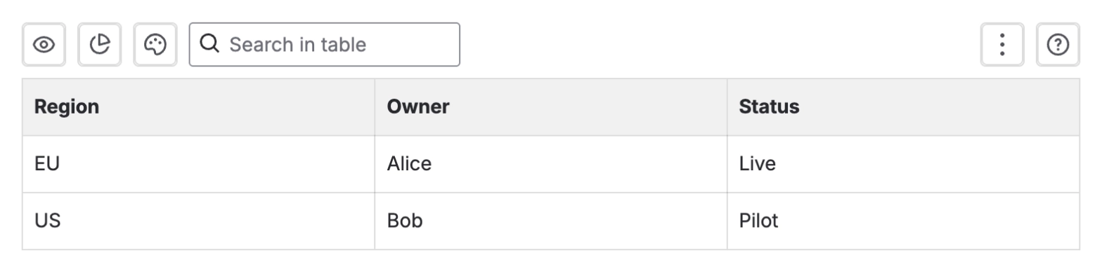
After: Capable
#Round Rectangle (deprecated)
Becomes | Capable Background |
|---|---|
Support | Partly converted |
Carried over
Fill colour and rounded corners
Title and footer, as the first and last paragraphs
Content
Not carried over
Square corners: every corner is rounded
Width
Separate title and footer colours
Before: Mosaic

After: Capable

#Detected but not converted
These are counted so you can see how many you have. They stay on the page exactly as they are.
#Smart Page Editor
Becomes | Not converted |
|---|---|
Support | Reported only |
Shown in the Mosaic menu as Smart Designer.
#BibTeX Reference
Becomes | Not converted |
|---|---|
Support | Reported only |
Shown in the Mosaic menu as BibTeX Referencing. References stay on the page and keep rendering from Mosaic.
Before: Mosaic
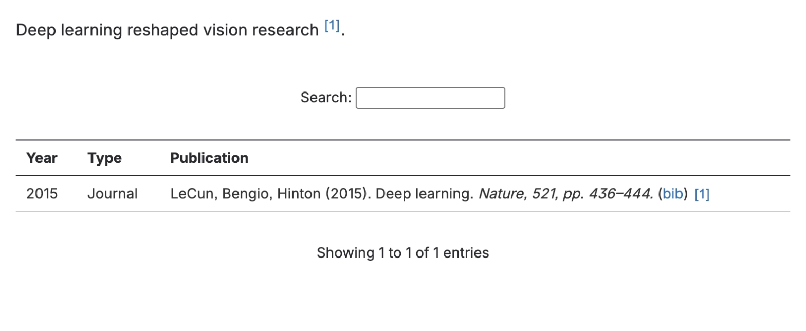
After: Capable
#BibTeX Display
Becomes | Not converted |
|---|---|
Support | Reported only |
Shown in the Mosaic menu as BibTeX Summary.
#Related
Native beats a macro, where native will do.