Aura Content Formatting for Confluence
Capable recognises 11 macros from Aura Content Formatting (Seibert). 11 of them convert, and none are left behind.
#At a glance
Macro | Becomes | Support |
|---|---|---|
Background | Capable Background, or a native Confluence panel | Converted |
Cards | Capable Cards | Converted |
Button | Capable Buttons | Converted |
LaTeX | Capable LaTeX | Converted |
Progress Bar | Capable Progress Bar | Converted |
Status | Native Confluence status lozenge | Converted |
Divider | Native horizontal rule | Converted |
Title | Native Confluence heading | Converted |
Panel | Native Confluence panel | Converted |
Tabs | Native Confluence expands | Converted |
Expand | Native Confluence expands | Converted |
#What each one does
#Background
Migrates to | Capable Background, or a native Confluence panel |
|---|---|
Support | Converted |
As with Mosaic: with an image it becomes a Capable Background; with no image it becomes a plain native panel in the matching colour.
What survives the move
Image address, background colour, image position, text alignment and padding
Container height, mapped onto large, medium or a custom height
What does not come across
Text colour, image opacity and corner rounding, which are set to fixed values regardless of the original
Worth knowing before you run it.
Where an Aura colour differed between light and dark mode, only the light-mode colour is kept, so migrated backgrounds can look wrong in dark mode.
Aura stores its whole configuration as one encoded blob. If that blob cannot be read the macro is reported unsupported and left untouched rather than migrated with defaults.
#Cards
Migrates to | Capable Cards |
|---|---|
Support | Converted |
What survives the move
Per card: title, body, colour and link
Column count, defaulting to 3
What does not come across
Images, migrated Aura cards have images switched off
Text colour, which is forced to white
Worth knowing before you run it.
The on-screen note claims flip cards and hover cards are converted using their title and body only. They are not converted at all, an Aura macro configured as flip or hover cards is reported unsupported and left on the page untouched. This is the clearest contradiction between the shipped wording and the actual behaviour.
#Button
Migrates to | Capable Buttons |
|---|---|
Support | Converted |
What survives the move
Label and link
What does not come across
All styling, every migrated button gets the default look
Worth knowing before you run it.
Consecutive buttons in one paragraph are grouped into a single Capable Buttons macro, and because that is a block macro the paragraph is split around it.
#LaTeX
Migrates to | Capable LaTeX |
|---|---|
Support | Converted |
Worth knowing before you run it.
Inline formulas become blocks, so the sentence containing the formula is split.
A macro with no formula is reported unsupported.
#Progress Bar
Migrates to | Capable Progress Bar |
|---|---|
Support | Converted |
One Aura macro can hold several bars, and each becomes its own Capable Progress Bar. A bar's label becomes a bold line above the bar rather than a property of the bar itself.
What survives the move
Each bar's percentage, colour and the shared height
What does not come across
Bar grouping
Any overall progress figure
#Status
Migrates to | Native Confluence status lozenge |
|---|---|
Support | Converted |
Worth knowing before you run it.
This migrator is registered twice, so it appears as two identical "Status" rows under Aura. They share one selection, so ticking either appears to tick both, and only one actually runs. Harmless, but confusing.
#Divider
Migrates to | Native horizontal rule |
|---|---|
Support | Converted |
#Title
Migrates to | Native Confluence heading |
|---|---|
Support | Converted |
#Panel
Migrates to | Native Confluence panel |
|---|---|
Support | Converted |
#Tabs
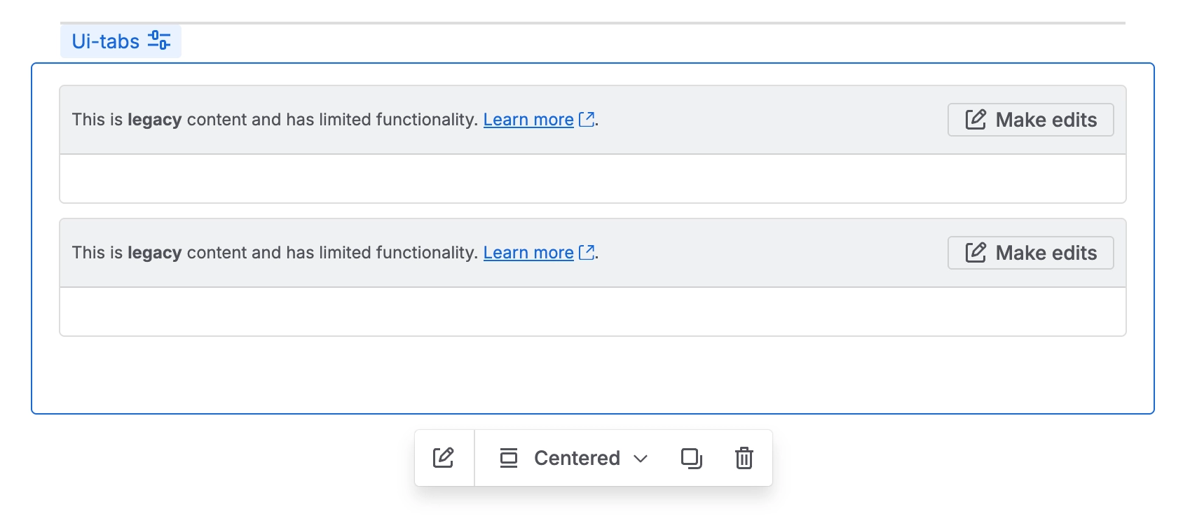
Migrates to | Native Confluence expands |
|---|---|
Support | Converted |
#Expand
Migrates to | Native Confluence expands |
|---|---|
Support | Converted |
#Related
Native beats a macro, where native will do.