Aura Content Formatting for Confluence
Capable recognises 18 macros from Aura Content Formatting (Seibert): 11 convert, fully or in part, and 7 are reported and left on the page.
#About the app
Aura Content Formatting is a Confluence formatting app from Seibert Media.
It adds panels, cards, buttons, dividers, titles, progress bars, status labels, expand and tab groups, backgrounds and LaTeX to a page.
#How Capable is different
Panels, titles, dividers, status labels, expand groups and tab groups become native Confluence content, so they keep working with no app installed.
Cards, buttons, backgrounds, progress bars and LaTeX move to Capable macros, keeping text, links, button colours and sizes, and progress values.
Tab groups become a stack of expands, and flip cards show both faces at once.
Only light-mode colours are kept; borders, shadows, hover effects, icons and status sets do not carry over.
Countdown, Dynamic Content, Child Tabs, Embed, HTML, User Profile and LaTeX Reference are reported and left unchanged.
#At a glance
Macro | In Capable | Support |
|---|---|---|
Panel | Native Confluence panel | Partly converted |
Cards | Capable Cards | Partly converted |
Button | Capable Buttons | Partly converted |
Divider | Native Confluence divider | Converted |
Title | Native Confluence heading | Partly converted |
Progress Bar | One Capable Progress Bar per bar | Partly converted |
Status | Native Confluence status | Partly converted |
Expand | Native Confluence expands | Converted |
Tabs | Native Confluence expands, one per tab | Converted |
Background | Capable Background, or a native panel for a plain colour | Partly converted |
LaTeX | Capable LaTeX | Converted |
Countdown | Not converted | Reported only |
Dynamic Content | Not converted | Reported only |
Child Tabs | Not converted | Reported only |
Embed | Not converted | Reported only |
HTML | Not converted | Reported only |
User Profile | Not converted | Reported only |
LaTeX Reference | Not converted | Reported only |
#New in this release
Buttons keep their own colours instead of turning theme blue.
A panel with a dark header or border becomes a light tint of that colour, so its text stays readable.
Cards with see-through colours, including the flip card default, now come out readable.
Formulas saved in Aura's inline mode stay inline, and text around a moved formula is joined back up.
Aura macros inside native panels, expands and table cells now convert to content Confluence keeps.
Countdown, Dynamic Content, Child Tabs, Embed, HTML, User Profile and LaTeX Reference are now counted and reported.
#What each one does
#Panel
Becomes | Native Confluence panel |
|---|---|
Support | Partly converted |
The panel type comes from its icon: info, success, warning or error. Other panels get a custom colour, with dark accents lightened so text stays readable.
Carried over
Headline, as a bold first line, with its link
Content
Panel type
Not carried over
Borders, shadow and spacing
Header bar
Text alignment and colours
Dark-mode colours
Before: Aura
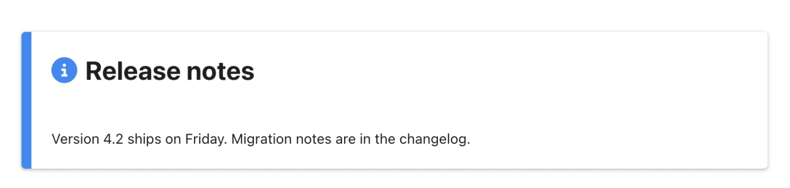
After: Capable

#Cards
Becomes | Capable Cards |
|---|---|
Support | Partly converted |
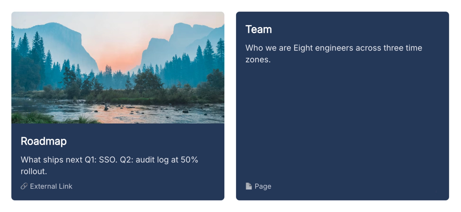
Covers classic, flip and hover cards. Flip cards show the front title and both faces' text at once.
Carried over
Per card: title, text and link (page, web address or email)
Images added by link
Column count
Card colour, as the card background
Not carried over
The flip and hover effects
Images uploaded as attachments
Icons and card styling
Before: Aura
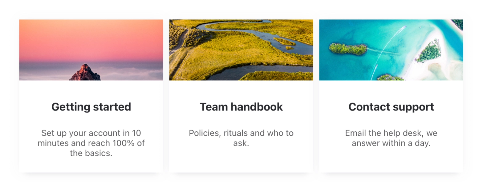
After: Capable
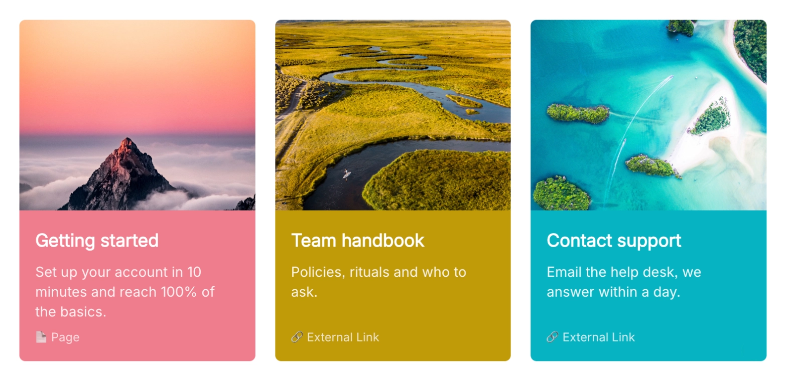
Before: Aura

After: Capable
#Button
Becomes | Capable Buttons |
|---|---|
Support | Partly converted |
Consecutive buttons are grouped into one Capable Buttons macro, which sits on its own line and splits the paragraph around it.
Carried over
Label and link (page, web address or email)
Open in a new tab
Colour and text colour
Size
Shape: round or square corners
Not carried over
Hover styling
Icons
Skewed shape: it becomes square
Minimum width
Before: Aura

After: Capable

#Divider
Becomes | Native Confluence divider |
|---|---|
Support | Converted |
Carried over
A text divider's label, as a bold line above the divider
Not carried over
Colour, thickness and style
Alignment
Icon
Before: Aura

After: Capable

#Title
Becomes | Native Confluence heading |
|---|---|
Support | Partly converted |
The heading level is chosen from the font size.
Carried over
Text
Alignment
Not carried over
Colour, font weight and line height
Before: Aura

After: Capable

#Progress Bar
Becomes | One Capable Progress Bar per bar |
|---|---|
Support | Partly converted |
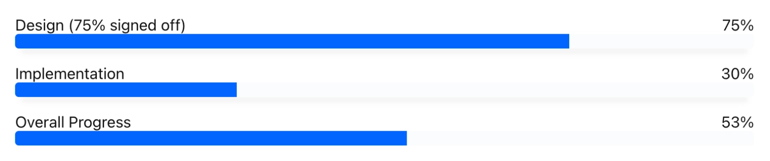
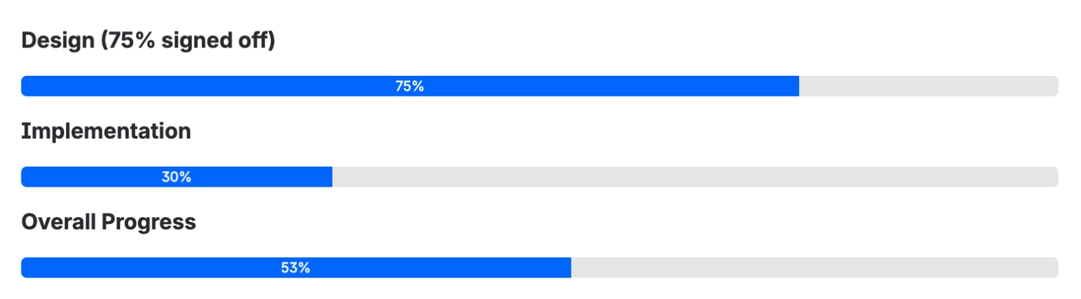
Each bar's label becomes a bold line above it. The overall bar is kept as one more bar, worked out once at conversion.
Carried over
Each bar's value, or amount out of a goal with its unit
Bar colour and height
The overall bar
Not carried over
Grouping of the bars
Circular style and shadow
Label and track colours
Before: Aura
After: Capable
#Status
Becomes | Native Confluence status |
|---|---|
Support | Partly converted |
The active row of the status set becomes the status, in the nearest Confluence status colour.
Carried over
Active label
Colour, matched to the nearest status colour
Not carried over
The other rows in the set
Size and text colour
Before: Aura

After: Capable

#Expand
Becomes | Native Confluence expands |
|---|---|
Support | Converted |
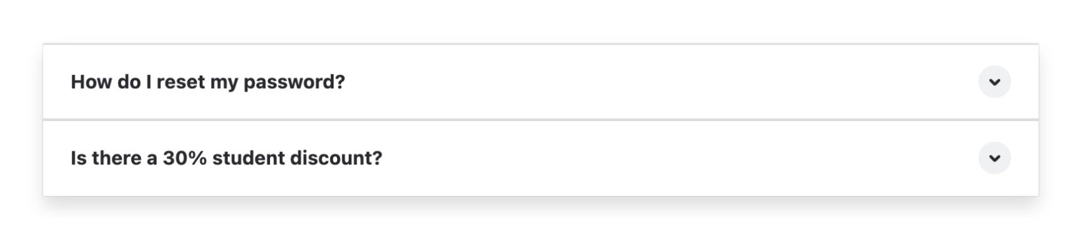
Covers Aura Expand Group, including groups brought over from Data Center.
Carried over
Expand titles and content
Numbered headings, as 1., 2. and so on in the titles
Not carried over
Design, icon and shadow
Highlight colour
Before: Aura
After: Capable

#Tabs
Becomes | Native Confluence expands, one per tab |
|---|---|
Support | Converted |
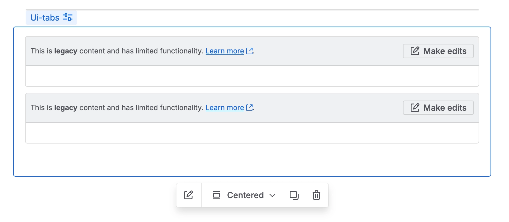
Covers Aura Tab Group, including groups brought over from Data Center.
Carried over
Tab titles, as expand titles
Tab content
Not carried over
The tab strip: tabs become a stack of expands
Tab styles and direction
Before: Aura

After: Capable

#Background
Becomes | Capable Background, or a native panel for a plain colour |
|---|---|
Support | Partly converted |
With an image, linked or attached, it becomes a Capable Background; a colour with no image becomes a native panel.
Carried over
Image
Light-mode background colour
Padding
Image position
Height: 300px and over becomes medium, 500px and over large
Not carried over
Dark-mode colour
Image size
Text colour, image opacity and corner rounding, which get fixed values
On a plain colour panel: minimum height and centring
Before: Aura
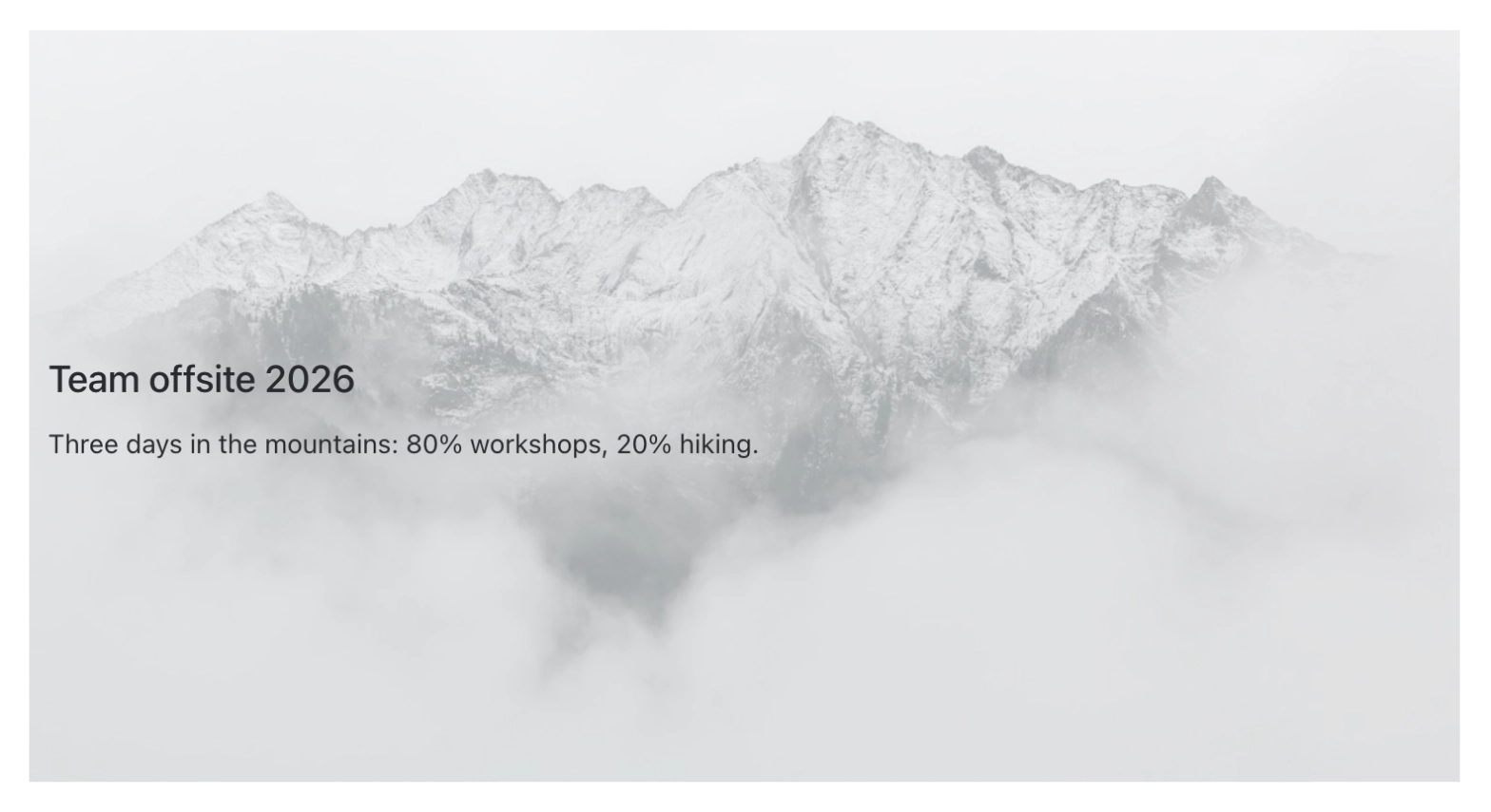
After: Capable
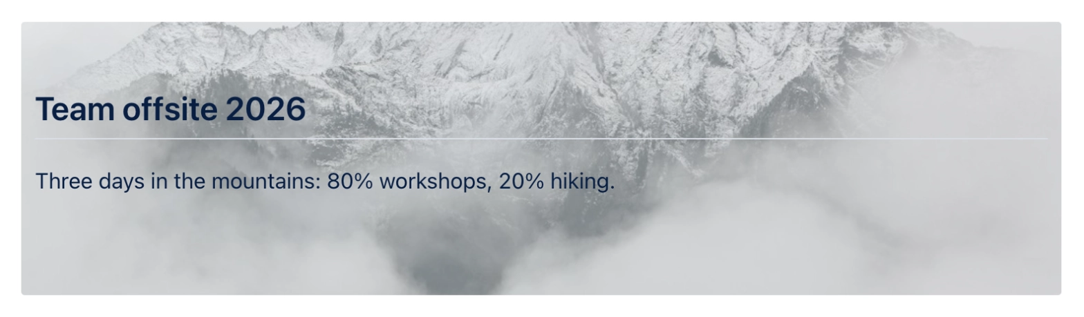
Before: Aura
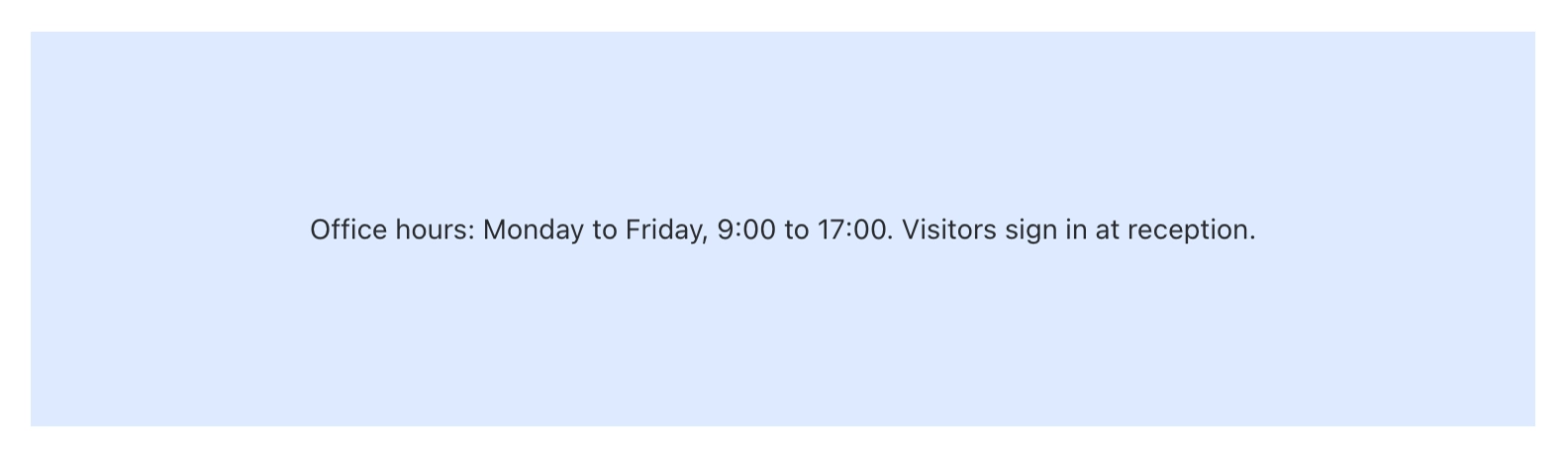
After: Capable

#LaTeX
Becomes | Capable LaTeX |
|---|---|
Support | Converted |
A formula saved in Aura's inline mode stays in the sentence. Any other formula moves to a centred block after its paragraph.
Carried over
The formula
Size: large formulas stay large
Not carried over
Anchor setting
Before: Aura

After: Capable

#Detected but not converted
These are counted so you can see how many you have. They stay on the page exactly as they are.
#Countdown
Becomes | Not converted |
|---|---|
Support | Reported only |
#Dynamic Content
Becomes | Not converted |
|---|---|
Support | Reported only |
#Child Tabs
Becomes | Not converted |
|---|---|
Support | Reported only |
#Embed
Becomes | Not converted |
|---|---|
Support | Reported only |
#HTML
Becomes | Not converted |
|---|---|
Support | Reported only |
#User Profile
Becomes | Not converted |
|---|---|
Support | Reported only |
#LaTeX Reference
Becomes | Not converted |
|---|---|
Support | Reported only |
#Related
Native beats a macro, where native will do.