Team/Project dashboard
#4.1 Context & challenges
Project and program spaces in Confluence frequently start with good intentions - an overview page, a status log, maybe a risks table - but quickly degrade into long, scroll‑heavy documents that mix executive summaries, detailed logs, and random attachments. Stakeholders complain that they “can’t see status at a glance,” while teams quietly stop updating pages because it feels like extra work on top of Jira updates and slide decks.
Another pain point is the fragmentation of visual aids and timelines. Architecture diagrams might live separately or in external tools; release dates in scattered Confluence tables or third‑party calendars; approvals in email or separate workflow apps. For large programs, this results in multiple “sources of truth” that never quite line up. When issues arise, teams lack a single page that shows context, decisions, risks, upcoming milestones, and relevant diagrams.
Capable’s all‑in‑one model - formatting, diagrams, calendars, approvals - provides the ideal substrate for rich dashboards that replace static status docs and standalone decks. The challenge for the use case pages is to present patterns that are visually appealing yet lightweight enough for teams to maintain weekly.
#How Capable Formatting helps
Capable Formatting’s macros make it straightforward to design scannable dashboards where key information is visible within the first screen, and details are progressively disclosed. For example, a project one‑pager can start with a status strip composed of Cards showing RAG status, current phase, and latest decision, followed by a Banner summarizing goals and scope. Beneath that, a two‑column layout can present KPIs and upcoming milestones on the left (using Progress Bars and small tables) and risks/issues on the right (using Panels or Cards with labels).
Tabs and accordions can then separate sections like “Detailed Risks,” “Decisions Log,” and “Architecture,” keeping the main view uncluttered. For each tab or expandable section, diagrams (from Capable Diagrams) and embedded calendars or event lists (from Capable Calendars) can be inserted. This supports a layered information model: executives see the top Cards and summary Banner; project teams can drill into tabbed detail when needed.
The broader Capable suite strengthens this story further. Approvals can capture formal sign‑off for milestones or design decisions; calendars provide a live view of sprint boundaries and releases; diagrams show evolving architectures; and Search Results macros can surface related runbooks or dependency pages from across spaces. The use case page should show how formatting macros “frame” these elements into cohesive dashboards.
#Key features and macros to highlight
For project dashboards, a focused set of macros delivers most of the value:
These macros allow dashboards to function as living artifacts, evolving with the project. Teams can start with a minimal layout (Banner + Cards + Progress Bar) and progressively add tabs for deeper sections as complexity grows. The use case page should highlight a pattern where the “top third” of the page always remains stable, even as lower sections vary by project type.
An original recommendation is to define standard status “cards” that reuse the same copy and visual treatment across projects - for example, a trio of Cards for “Status,” “Risks,” and “Next milestone.” This encourages comparability across dashboards and reduces cognitive load for leadership reviewing multiple projects.
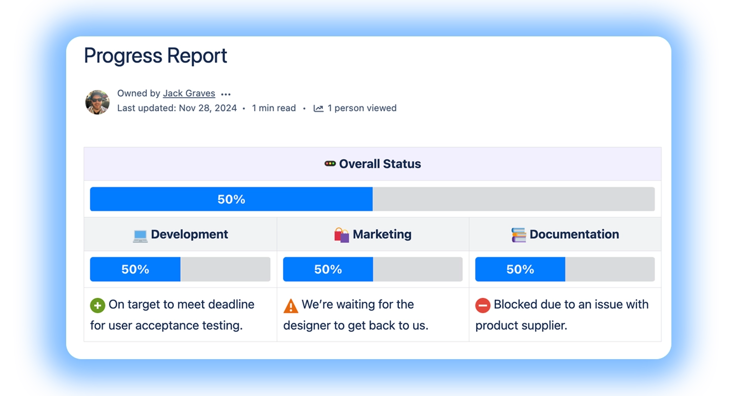
#Cards
For RAG summaries, key metrics, and quick links to Jira boards or sub-pages.

Dragon Fruit
Dragon fruit is a tropical fruit known for its unique appearance and sweet flavor.

Rambutan
Rambutan is a juicy, hairy-skinned fruit native to Southeast Asia, offering a sweet and slightly acidic taste.

Durian
Known as the 'king of fruits', durian has a strong aroma and creamy texture that divides opinions.
#Progress Bars
To visualize completion of phases, epics, or deliverables.
Put them into tables for more information:
#Progress Trackers
Show progress through several steps.

#Tabs
To separate summary vs. detail (e.g., “Overview / Risks / Decisions / Architecture”).
Welcome aboard!
You can include formatting, tables and images, panels etc.
Here is a panel
Table | Table | Table |
|---|---|---|
This is some cards - we are working to align the styling.


You can include macros like diagrams within tabs.
We’re a small, cross‑functional team focused on making complex tasks simple. Our aim is to deliver clear, reliable solutions that help people get work done with confidence.
#Banner
For top-of-page context (project name, sponsor, timeframe).


#Diagrams (suite/diagram app required)
To embed system diagrams or process flows see Confluence Diagrams.

#Calendar / Event macros (suite/diagram app required)
For release calendars and key dates see Capable Calendar
#Example dashboard layouts
The use case page should describe at least three canonical layouts: Project one‑pager, Program/portfolio overview, and Weekly status update. Each can reuse macro combinations but with different emphasis.
Dashboard type | Layout highlights & macros |
|---|---|
Project one‑pager | Hero Banner; RAG status Cards; Progress Bar for overall completion; brief scope Panel; tabs for Risks/Decisions/Timeline/Architecture |
Program/portfolio view | Grid of Cards (one per project) summarizing status; optional grouping by initiative; link each Card to its project one‑pager |
Weekly status update | Compact Banner with week label; sections for “What happened,” “What’s next,” “Risks & decisions,” each using Panels/Cards; optional tab history |
The Project one‑pager pattern should be treated as the primary template; the others can be derived from it. For example, the portfolio view can use the same status Card design but aggregated at a higher level. The Weekly status page can share the same risk Panel styling but with a focus on the current sprint or week.
By standardizing these layouts, teams can avoid constantly reinventing dashboards or relying on external slide decks. It also makes it easier to plug in Approvals for formal gating (e.g., “Ready for Launch” sign‑off) or Publishing rules for moving finished reports into a knowledge base.
#Implementation tips
A key implementation tip is to standardize on a dashboard template per project type (e.g., product development, infrastructure upgrade, marketing campaign). Use Capable to create a named template containing Banner, Cards, Progress Bars, and placeholder tabs. Encourage teams to create new project spaces from these templates so that portfolio roll‑ups remain consistent. Over time, organizations can evolve the templates (e.g., adding a standard “Risk ownership” section) without intrusive rework.
Second, teams should consider how Jira, Confluence, and Capable intersect. Capable’s dashboards are best used for narrative and multi‑artifact context, not for replicating every Jira view. The use case page can recommend embedding only one or two key Jira reports/links per dashboard and using Cards to route users to relevant boards, while keeping the dashboard focused on digestible narrative and risk/decision context.
Finally, be mindful of Tabs limitations. For example, avoid placing heavy tables with sorting or complex nested macros inside Tabs, given known rendering issues and feature gaps. Where possible, keep tables on the main page or use Panels and headings instead. The use case page should provide alternative layouts (e.g., “Use stacked Panels with headings instead of Tabs”) for organizations with heavy reporting needs or strict accessibility requirements.